Bitcoin Charts – How to Read Them
A simple and easy to follow guide to help you read the charts associated with Bitcoin trading and give you some pointers of things to look out for.

Getting into the world of cryptocurrency trading can be challenging at times. This is particularly true if you are trying to understand the wide variety of graphs that you will inevitably come across on your trading journey.
We have compiled this simple and easy to follow guide to help you read the charts associated with Bitcoin trading and give you some pointers of things to look out for. For this guide, we will be focusing on buying and selling options and using the real exchange interface to give you visual cues along the way.
Bitcoin Price Charts: The Basics
The first thing you will want to know about Bitcoin, or any other cryptocurrency is the price. These charts are relatively easy to follow once you understand what you’re looking at.

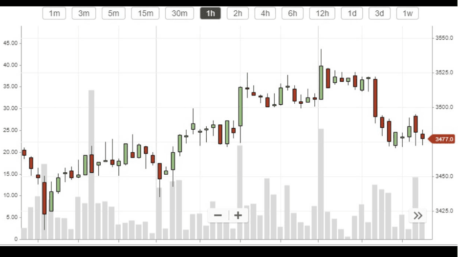
The graph above shows a single price spread for Bitcoin to USD. The horizontal top axis allows you to choose a time frame to look at. We chose to show the price variations over the course of an hour. Price intervals according to that time frame will appear on the bottom horizontal bar.
On the right-hand vertical axis, you will see a number highlighted in red at $3,477. This is the current price of a single Bitcoin in US dollars. The left-hand vertical axis shows the price variation.
You will notice that the chart is made up of red and green bars. These are known as candlesticks. Green indicates an increase in price with red showing a decrease in price. The longer the candlestick – the greater the increase/decrease. Smaller candlesticks of any colour show only minor fluctuations.

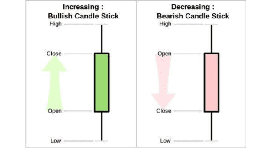
The above diagram shows the candlesticks more clearly.
Bitcoin Charts: Busting the Jargon
There are terms that you might not have come across before, when you were looking at information about charts. When you look at these terms, you will notice that there are a lot of words that you might not understand. To solve this, we have compiled a simple glossary of chart terminology for your convenience:
- Bullish Trend – This term describes a significant increase in the price of a coin. Often bullish trends are breakouts from previous drops and can indicate substantial price increases in the cryptocurrency trading sphere.
- Bearish Trend – This is the opposite of a bullish trend and denotes a significant decrease in a currency’s price. Again, these drops can be quite dramatic.
- Low – The low denotes the lowest trading point (price) for the currency within the specified time frame.
- High – The high denotes the highest trading point (price) for the currency within the specified time frame.
- Open – The open denotes the price of the currency at the opening time of trading or the beginning of the specified time frame.
- Close – The close indicates the final price of the currency at the end of trading or the end of the specified time frame.
Other Things to Look for On Your Bitcoin Graph
As you become more adept at reading the graphs you will notice other important information that will prove invaluable ashttps://coinmarketcap.com/currencies/volume/24-hour/ you become a more proficient trader. Hovering over a chart for instance, will show you something called trading volume. This is the amount of trading activity that occurred or is occurring at a specific point in time.
This is useful because you will be able to see when large amounts of currency are sold, which might indicate that the price of an asset might be heading further down. Volumes are a good way of feeling out the market. If you notice low trade volumes but the currency is rising, it is an indication that traders expect the currency to rise further and are holding.
Percentages
You don’t need to be a math wizard to understand the percentages on graphs for Bitcoin or other cryptocurrencies. These mainly demonstrate the fluctuations in price. In simple terms, the rate a currency has increased or decreased by in terms of price.
Some Exchanges Simplify Everything for You
Although these pointers are the same across the market, you will notice that different exchanges show cryptocurrency prices in a variety of ways. The likes of Coinbase, CEX.IO, and Coinmama are particularly good because they have a very simple and user-friendly interface. To trade on these platforms, you wouldn’t need to use in-depth candlestick charts, as buy/sell prices are always displayed clearly. They have pre-defined offers, and it is simple to see how much it will cost to buy an amount of Bitcoin. These are collectively known as buy prices.
You will notice, however, that the cost of buying is higher than the cost of selling at any point in time. This difference is known as the spread and helps exchanges or brokerages facilitate deals by covering costs associated with trading. It is the same set-up as if you were trading shares on a stock exchange.
Simple Price Charts
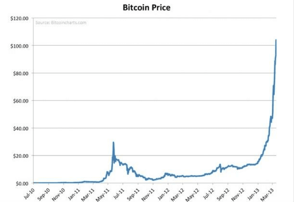
There are other resources you can use to figure out the price of any given crypto asset. To round off our guide, we will discuss the most commonly used price charts for cryptocurrency across the web. These are very straight forward and show the price of a currency over a defined time frame with a line that often resembles a mountain landscape.

As you can see from this historical graph, the vertical axis has price levels and the horizontal axis has time values (in this case month and year). The line in the graph itself is simply tracking the movement of the price of Bitcoin over time to form one continuous line.
Now You Know How to Read Bitcoin Price Charts
And that is it! These are all the basic pointers you should know to read various types of cryptocurrency price charts, along with the terms you will encounter on various platforms. Remember to keep track of trading volumes and see where you can find opportunities in the market.


